1.2 Normal Wide w/ Contrast -5
1.4 ProCinema Frame w/ Contrast -5
These tests examine the latitude of the GS400, particularly how highlights are handled in a number of modes. These are basically 2x2 tests, with the variables being Normal Wide mode verses ProCinema Frame mode, and no Contract Picture Adjustment versus Contrast -5 Picture Adjustment. All other variables are constant within each test. Photoshop histograms are included for all of the images. Click an image for a full frame.
The first two tests are exposing for highlights. The exposure was set in ProCinema mode, stopping down just until all zebras disappeared. This was just past F16. The exposure hit F14, then F16, then turning just until the next increment, which isn't displayed on the LCD, but is distinguishable because the zebras went away (likely F19). The thought behind this test is that with ProCinema capturing as much highlight detail as possible, what will we lose in the other modes? Also, how much shadow detail are we losing when exposing for very bright highlights?
Zoom: Full Wide; Focus: MF on house; Shutter: 1/60; Iris: F16+1tick; WB: Outdoor
| 1.1 Normal Wide |
1.3 ProCinema Frame |
1.2 Normal Wide w/ Contrast -5 |
1.4 ProCinema Frame w/ Contrast -5 |
First things first, take a look at the left sides of the histograms in all of these images. They are not spot on identical, but they are darn close to it. Now look at the right side. Radically different! So, the settings seem to effect handling of mids and highlights, mostly highlights, without effecting the shadows, pretty much anything under 40IRE. Basically, in these images the interiors are interchangable. Only what comes though the windows is different.
So, what is different? Starting with 1.1, we can see the clouds are overexposed, clipped, white blobs. The histogram confirms this.
With contrast down in 1.2, the whole histogram is gently squeezed over to the left. We're out of clipping range, and we can see the details in the clouds. Yet, the image is slightly dull, because we aren't using the full dynamic range, the full histogram. There's wasted space on the right, dead space. We could have opened the iris perhaps a half-stop, and we would have a better looking picture, with detail, and without clipping.
1.3 is ProCinema, probably the best of this bunch. While it doesn't use the full histogram, it uses more than 1.2. Also, the highlights are treated differently. There is a different curve at play here. The histogram is not all squeezed over to the left. The shadows are nearly identical to normal, the mids are slightly squeezed, and the highlights are very squeezed. If this were a curve, it would be a diagonal line up and to the right, then gently it would start to curve more right, and finally get rather flat shooting out the right. This image, too, could have been opened up a bit and would have been better.
1.4 shows the compound effect or the overall squeeze of contrast reduction and the localized squeezes of ProCinema. It looks the worse of the bunch because it uses so little of the dynamic range. It has no more detail than 1.2 and 1.3, just duller. However, with the iris opened perhaps three-quarters to a full stop, it has the potential to be the best of the bunch, with enormous latitude.
It bears repeating that in Test 1, I adjusted the exposure for 1.3, and, it turns out looking the best. Still, we have learned quite a bit about how these modes work as a result of this test.
In this test, the exposure was set in Normal Wide mode, just until there were no zebras. This happened to be F16 plus two extras increments (likely F22).
Zoom: Full Wide; Focus: MF on house; Shutter: 1/60; Iris: F16+2ticks; WB: Outdoor
2.1 Normal Wide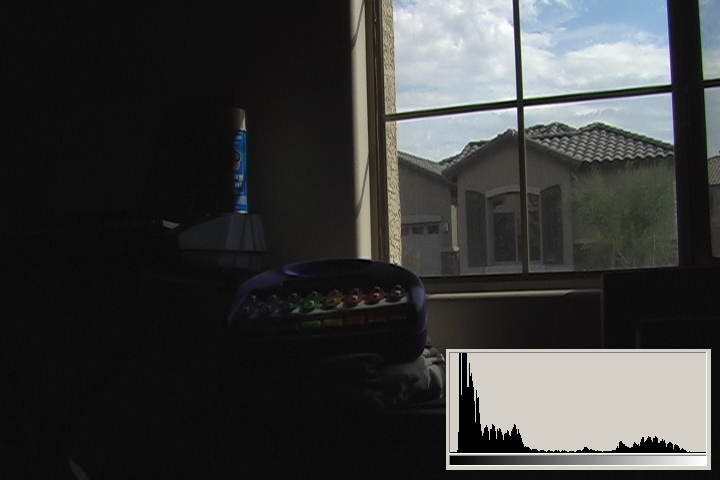 |
2.3 ProCinema Frame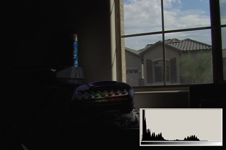 |
 2.2 Normal Wide w/ Contrast -5 |
 2.4 ProCinema Frame w/ Contrast -5 |
You can tell right away from the histogram on 2.1, that this is going to be a good picture. It really uses the full dynamic range, and it looks detailed and punchy.
2.2 doesn't have anything special that 2.1 doesn't, and it's squeezed up, so it looks dull. Needs to be opened up to reach its full potential.
2.3 is the same story, but slightly different, and I give it a subjective edge over 2.2. Needs to be opened up.
2.4 is again the worst of the bunch and needs to be opened way up.
Again, this image was exposed for 2.1, and 2.1 looks best. No big surprise, and lots of wasted potential for the alternate modes, at least in this test scenario.
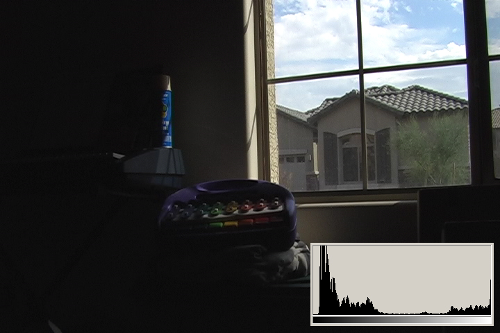
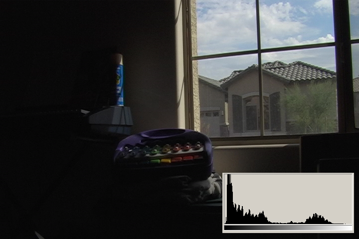
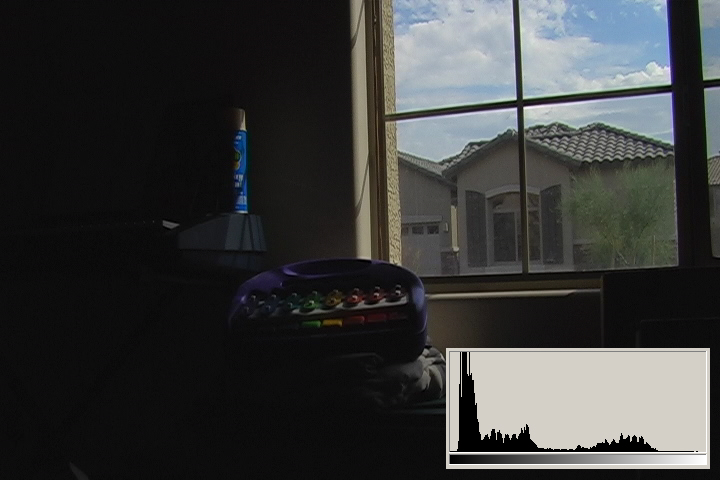
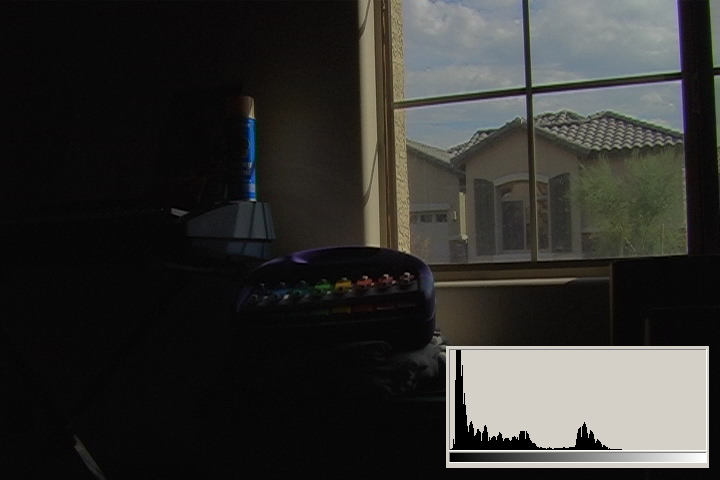
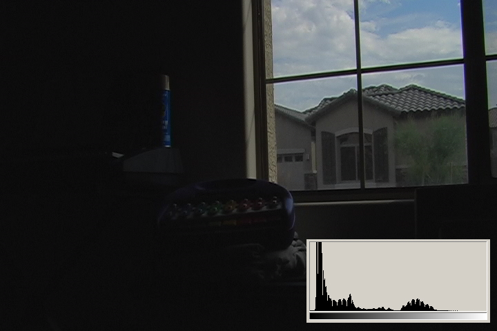
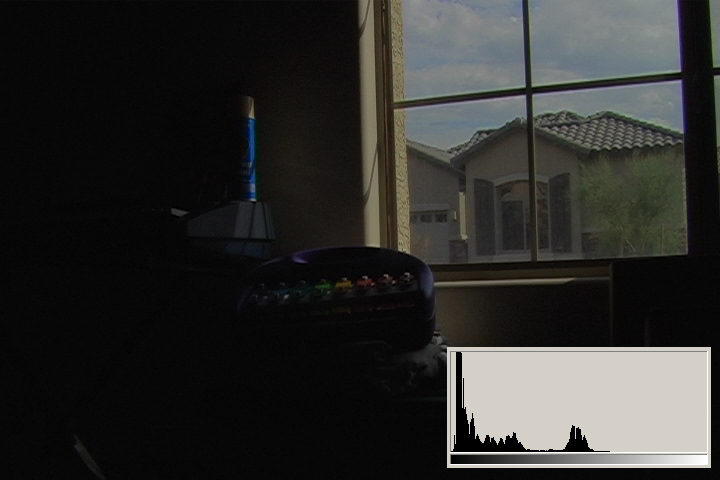
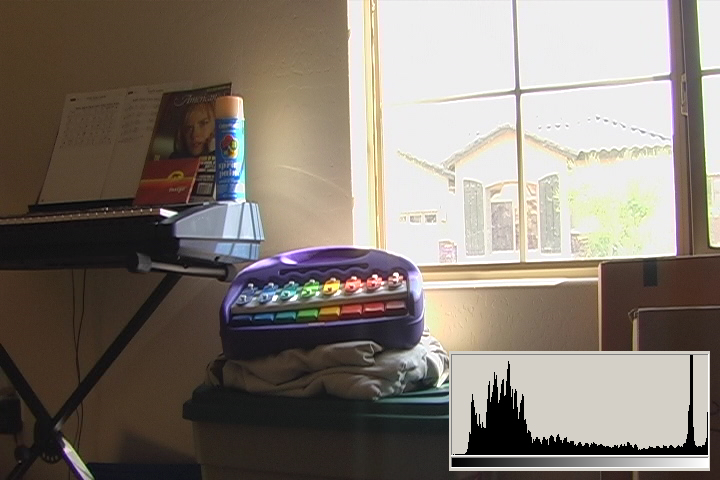
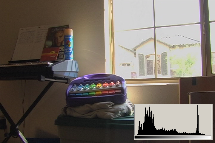
In this test, the exposure was set for the interior. It was set in Normal Wide mode no picture adjustments, without regard to zebras, because it was assumed that much of the window would blow out. The point of the test was to see just how much exterior highlight detail could be captured while exposing for the interior. The exposure was F4.
Zoom: Full Wide; Focus: MF on little tykes keyboard; Shutter: 1/60; Iris: F4; WB: Outdoor
3.1 Normal Wide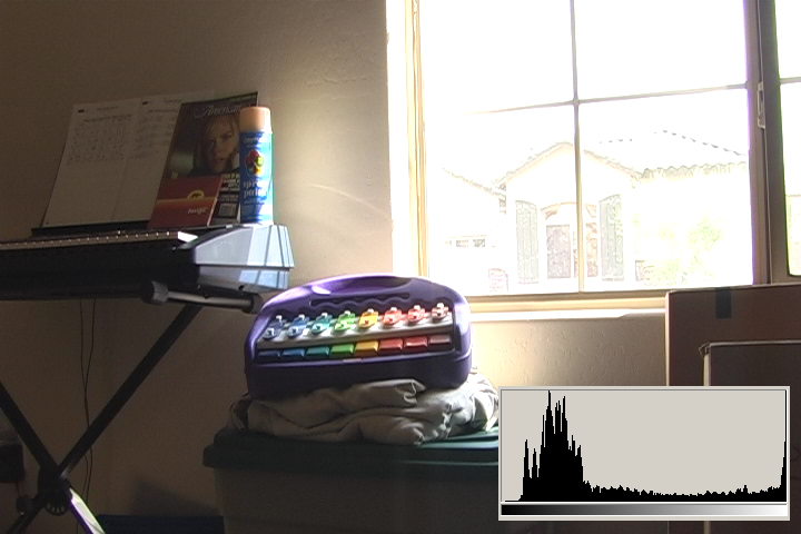 |
3.3 ProCinema Frame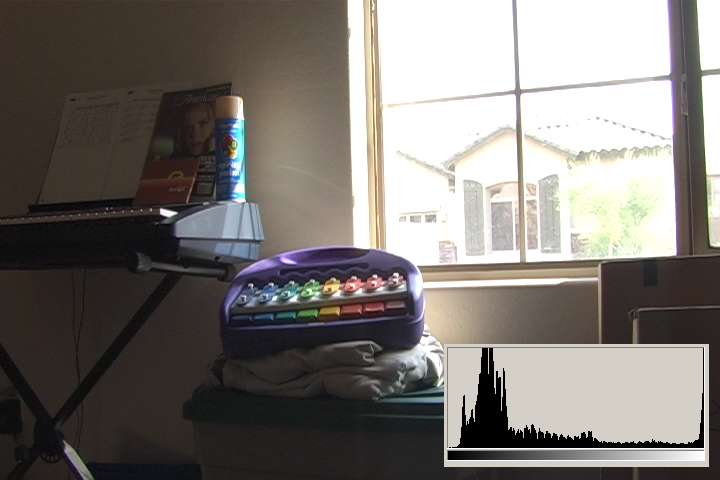 |
 3.2 Normal Wide w/ Contrast -5 |
 3.4 ProCinema Frame w/ Contrast -5 |
This is the most illustrative test of the bunch. Let me freely admit that Test 1 and Test 2 are, in a way, flawed. They were exposed for the highlights, but based on the highlights in only one of the modes. Yet, the highlights are handled so differently in each mode, they needed to be independently adjusted, but were not. Of course, I only learned that behavior after running the tests and analyzing the images. So, I will do a better version of those tests at some point.
Test 3 is much better, because it exposes for the shadows, and the shadows are uneffected by the different modes. Now at F4 we can see the Yamaha keybaord, a Fatigo CD, May 2005 American Cinematographer with Nicole Kidman on the cover, and a can of spraypaint.
3.1 is what we typically expect from consumer digital video cameras when shooting daytime interiors: blown out blobs where the widows are supposed to be. We can actually see just a hint of some of the darker exterior elements, the overhang and shutters. The histogram shows clipped highlights running up the right side at 110IRE/255.
3.2 is much better. The contrast reduction recovered some detail out there. You can tell there is a house across the street at this point. What's weird is that there is a band of clipped highlights at 100IRE/235, some more detail, then more clipped highlights at 110IRE. This would seem to be an image processing, probably because we're are still what could be considered extremely overexposed outside the window, by four or five stops.
3.3 shows similar highlight detail as 3.2. It also has no anomolies on the histogram, it smoothly rolls up to 110IRE and clips. However, there is something seemingly harsh about the image, and 3.2 looks more pleasing to me.
3.4 shows the most detail in the highlights. You can see the inside, and quite a bit of the outside as well. This is an example of maximizing the latitude of this camera. No, you can't the inside and the outside looking good at the same time, not even film could do so in these lighting conditions, but you do eliminate the amatuerish look of blown-out windows.
Here's what I am taking away from these tests.
More tests coming...